Evaluative Usability Testing on CP24 App Home Tab
My Role:
-
Led usability testing to assess post-redesign issues on the Home tab.
-
Ran mixed-method analysis and synthesized key navigation insights.
-
Delivered design recommendations that shaped the product roadmap.


TL;DR
Following a wave of user complaints after the CP24 app redesign, usability testing was conducted to uncover navigation and layout issues on the Home tab, following with whole tab investigation. Insights from two research rounds informed product priorities and shaped upcoming design improvements across our news apps.
PROJECT SCOPE
-
Research Categories: Evaluative/ Discovery Research
-
Client: Bell Media
-
Role/ Contribution: UX Researcher / UX Strategist
-
Timeline: 6 weeks
- Cross-Functional Teams: UX Design, UX Research, Product Owner, UX Manager
- Users: Canadian and English-speaking News consumers
📚 BACKGROUND
The CP24 app is a Toronto-based news platform under Bell Media, delivering real-time news, traffic, and weather updates. In late 2024, the app underwent a full redesign using ArcXP, a CMS framework to make the work and content design easier for the internal teams.
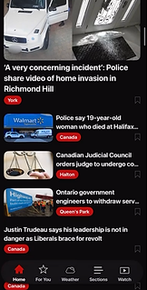
Shortly after the relaunch, the Home tab became a pain point. The new design, while aligned with ArcXP’s template, felt unfamiliar to users. Google Play reviews reflected this, many users complained about difficulty finding content, missing features, and confusing navigation.
The product owners needed UX research to uncover the root of user dissatisfaction and guide improvements.
🔍 Problem
User Problem:
-
“I can’t find anything with this new app”
-
“Everything looks the same, no sections?”
Very poor format!
I really dislike the new format. It is hard to read and some articles are front and centre. Yes, put the newest news at top, but not like this!
Horrible
The News should be broken up into different categories in a better way, so I can find what I'm looking for quick by just exploring on the homepage. This is so confusing!
Business Problem:
-
Negative user reviews
-
Limited visibility in Internal teams on what wasn’t working
-
Needed to clarify whether the issue was content, layout, or something else
New App is the worst app...
Used to be a good app, but new update made it horrible to use. Seems it is designed for Gen Z and it's over situating!
Very disappointed!
Old one was much better! This one lets you pick sections you want to see, then shows everything anyway on the homepage! No thanks!
🎯 Research Goals
-
Understand how users navigate the current Home tab
-
Identify which content is easily discoverable (or not)
-
Measure user sentiment around layout, design clarity, and interaction flow
-
Provide actionable insights to guide the next design sprint
How Might We improve content discoverability and navigation on the CP24 app to align with user expectations and reduce confusion following the ArcXP redesign?
🧪 METHODOLOGY
To evaluate the redesigned CP24 app and uncover friction points in the Home tab, I conducted two rounds of unmoderated usability testing via UserTesting.com. This exploratory, qualitative approach captured natural user behaviors without facilitator bias, helping us identify both usability issues and navigation patterns.
Sessions were analyzed using thematic coding, supported by metrics like task completion and time-on-task to inform design decisions. By triangulating insights across focused and holistic app tasks, we ensured findings reflected real user needs and mental models.
🧭 Evaluative Usability Testing
Round 1 : Focused usability study on Home Tab
-
Participants: 10 Canadian, English-speaking News app users (Usertesting.com)
-
Objective: Identify usability friction within the Home tab experience
-
Materials: Live CP24 app (ArcXP first launch version with region sections on Home tab)
-
Key Tasks: Find a local section and News category by exploring on Home tab
The Home page just goes on forever. I kept scrolling and missed things there.
🐾 Findings
-
Users struggled to distinguish content due to lack of clear section headers and poor visual hierarchy.
-
Redundant blocks with repeated articles added more confusion.
-
Region-specific stories were buried deep in the scroll, and often missed.
Round 2 : Exploratory and Evaluative Navigation Flow on Full App
-
Participants: 10 Canadian, English-speaking News app users (Usertesting.com)- Not from round 1
-
Objective: Explore content discovery journey and how users navigate across tabs to find the contents
-
Materials: Updated CP24 app after round 1 insights (regions removed from Home tab; available in Sections tab)
-
Key Tasks: Find a local section and News category by exploring on whole app and various tabs
I looked everywhere for "Editor's Picks", It is not even in Section tab. Maybe I missed it on Home and need to check again.
🐾 Findings
-
Regions were easier to find in the Section tab than on Home.
-
Navigation in Home, relied on scrolling, which lacked structure, and failed to guide users to deeper content due to weak visual hierarchy.
-
Inconsistent navigation, and unclear paths to the same content causing confusion and backtracking.
🧩 DESIGN IMPLICATIONS
These are a few key insights and design actions drawn from two rounds of usability testing on the CP24 app. They reflect recurring user pain points and resulting design adjustments.
For more findings or details, feel free to contact me by email.
🛠️ Key Findings to Action
🐾
Users struggled to distinguish between content sections, often overlooking them due to weak visual hierarchy and unclear UI cues.
Implemented consistent headers and clear visual separators, enhancing font hierarchy to improve visual distinction between sections.
Grey background to stand out the section
Header Font consistency and less boring

🐾
Distracting and unnecessary tags cluttered the interface, reducing content clarity and user focus.
Tags were streamlined and applied only to essential content for a cleaner, less distracting interface.
Before

After
🐾
The region-specific section was hidden too far down the Home tab, making it difficult for users to find.
1- Moved key local news with local tags higher in the Recent News section and removed the region section to reduce scrolling on the Home tab.
2- debated on filters and a content list at the top of the Home tab to help users quickly understand and access available information.

Before

After
The goal of reducing scroll length on the Home tab prompted an exploration of horizontal scroll patterns on the video hub to enhance video discoverability and accessibility.
🧪 REFLECTION
💡 What I Learned & Evolving Scope
This project began as a focused evaluation of the Home tab layout, but user behaviors revealed deeper issues with navigation structure, editorial content logic, and CMS constraints. It shifted from testing a single feature to surfacing system wide gaps, across all Bell Media brands.
🧠 Business and Research Impact
Product Impact
Research shaped the product backlog prioritization, and it has defined the client’s product roadmap, with key insights serving as stepping stones to achieve their market expansion strategy.
Design Impact
The experience improved trust with designers, and reinforced the importance of staying open to scope evolution and using user insights to drive cross-functional collaboration beyond the original brief.
Team Impact
Research now seen as a strategic partner, requested upfront by the stakeholders, with more engagement in usability discussions early in the process